By Rod Reuven Bryant, Dir of Education, NETIV
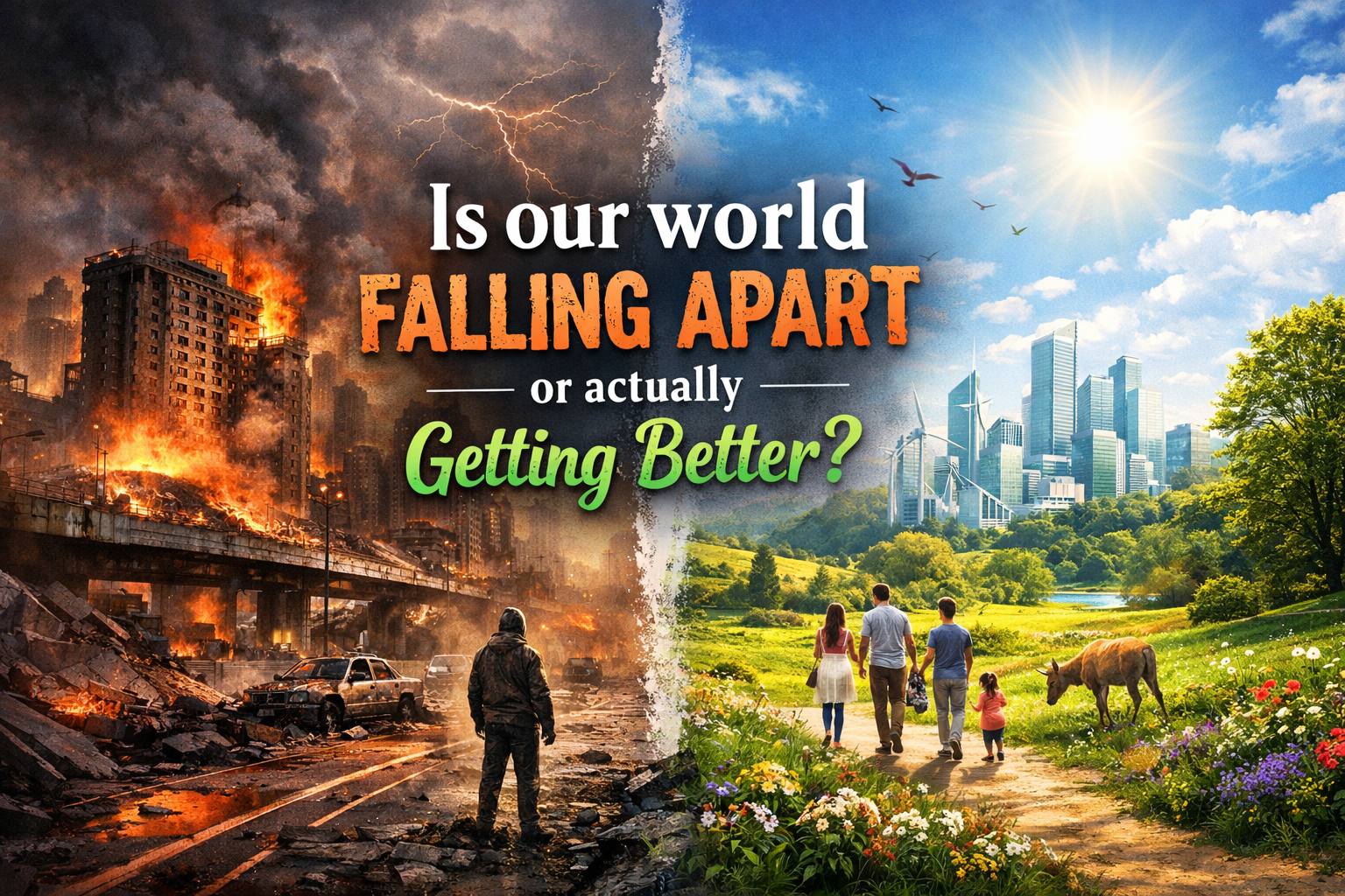
Yeah, I get why it feels like everything’s falling apart—headlines scream disaster every day. But if you step back and look at the actual numbers, the world is measurably better than 50 years ago, or 100. Not perfect, but way less brutal for most people.
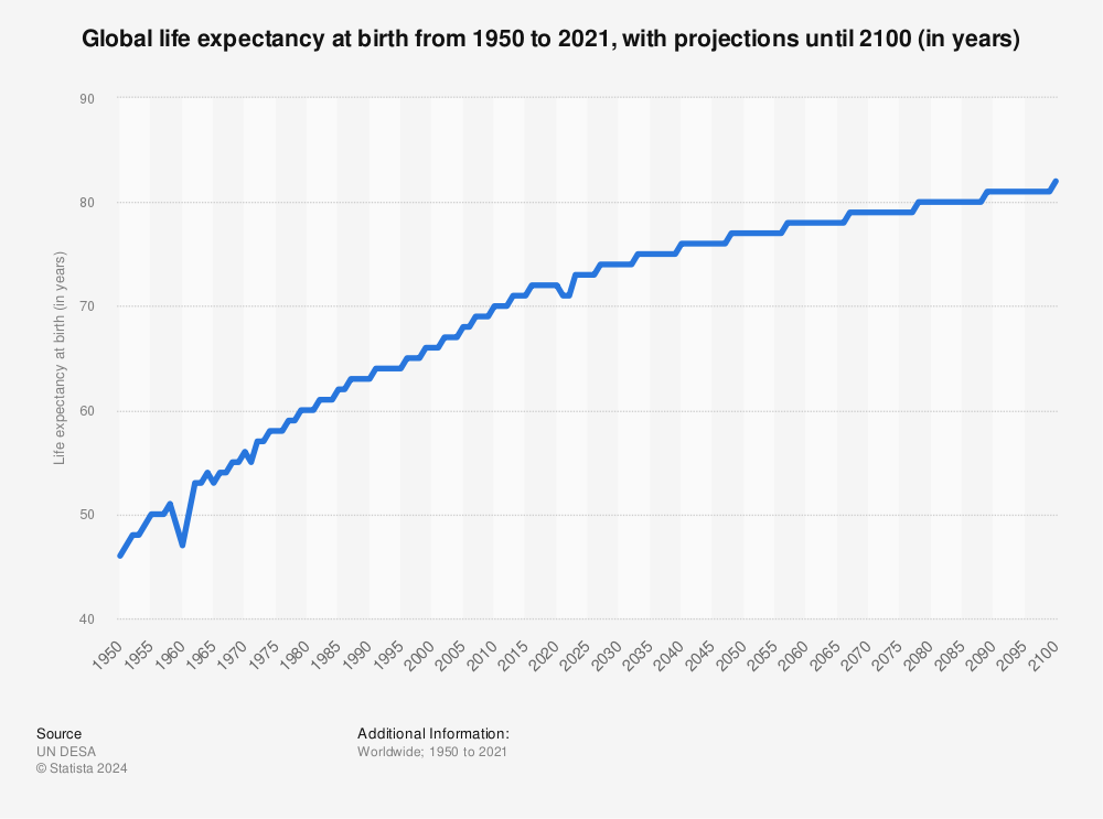
Take life expectancy: back in 1975, global average was around seventy-four years. Now? It’s pushing seventy-seven, heading toward eighty. Vaccines, clean water, better food—stuff that used to kill kids young is rare. Here’s a quick visual on that rise:
Child deaths? In the seventies, about fifteen percent of kids didn’t make it to five. Today it’s under four percent—millions fewer tragedies every year. Look at this drop-off:

Poverty’s the big one. Extreme poverty—living on less than three bucks a day—hit maybe thirty-eight percent in the mid-seventies. Now it’s under ten percent globally, even with population boom. Billions lifted up. Check this chart—red line’s the poor, green’s everyone else:

Even violence: battle deaths per capita? Peaked in the forties and fifties, then crashed. The seventies had spikes from wars, but overall trend’s down—way fewer people dying in conflict now than back then. This old graph nails it:

Sure, climate’s scary, inequality needs improvement, and news amplifies the bad. But on health, hunger, safety? We’re winning, slowly. Progress isn’t flashy—it’s quiet, steady, and real.